
5 Best Neutral Pink Paints
Pink is such a happy color that brings lots of joy and cheer with it. I’ve been wanting to step out of my comfort zone for our upstairs guest bedroom, and I had landed on a happy sunset-esque style pink. Can you believe it? This neutral-loving gal is breaking all the rules.
I want the space to feel warm and cozy and inviting. Since guests and humans don’t spend more than a few days at a time in this space, it’s the perfect spot to start experimenting with someone out of the usual for us. However, there is a huge wide world of the color pink out there. Some feel like bubblegum, some feel bright, some feel peachy, some feel moody, some border on being a neutral. There’s a lot to choose from.
pink is a color you need to consider
I have been researching for the past few weeks what color pink would feel right. It definitely started to feel like the tale of Goldilocks and the Three Bears. Some felt too childish, some felt too bright, and some felt way too moody and muddy. I wanted something that was warm, cozy, classic, and a little unexpected without feeling loud and overpowering.
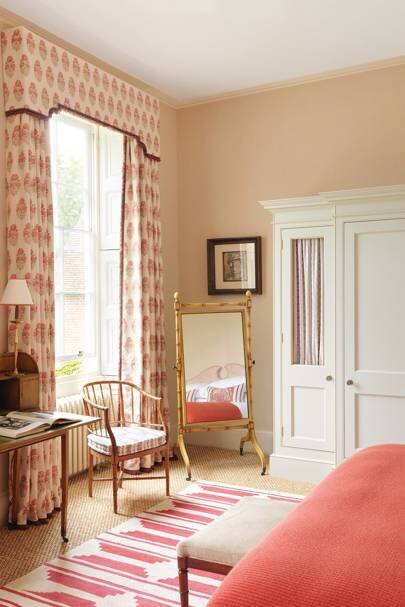
Source: Veere Grenney House & Garden UK
For me the right shade of pink in my search met the following criteria
Hint of warmth
Saturated without being overly bright
Classic
Played well with other colors
Tissue Pink by Benjamin Moore
Designer Thomas O’Brien swears by this pink and in his article with Architectural Digest, it was coined as the most flattering color of paint ever. I love that it is soft and subtle, but feels unique and personal. This would be such a great color in a bathroom (extra flattery is always welcome in a bathroom) or in any living space in your home.

Wing It by Clare Paint
Wing It is such a lovely color. It is one of the best selling paint colors by Clare and it is so incredibly versatile. It feels sophisticated and it is not too light and not too dark. It gives that feeling of being juuuust right. I think it could be a wonderful fit for any space.

Source: Wing It via Clare Paint
Pink Ground by Farrow & Ball
Pink Ground by Farrow & Ball is a lovely dusty pink color that doesn’t feel overly sugary. It’s delicate and soft. It is paired beautifully with a warmer white trim create a cozier feel.

Source: Pink Ground by Farrow & Ball
Pink Shadow by Sherwin Williams
This is a more saturated and true pink compared to the other ones I rounded up, but I love how it feels in this bedroom. If you desired something just a little lighter, having the paint mixed at 50% or 75% could help soften it even more. It sets the stage for a cozy and inviting space.

Setting Plaster by Farrow & Ball
This is one of the top selling colors for Farrow & Ball. It’s got a real following. I love how it’s saturated, but not too dark. It reads peachier in some sunlight, but also still has it’s roots in a dusty, tan type of pink.

Source: House & Garden UK
How are you feeling after all this color? I’m taking the advice of the extremely talented Interior Designer, Rita Konig, which she says stay the course whenever you are experimenting with color. Remember to build on the color and not let it feel like the only player in the room. It may feel jarring when it first goes up because it’s typically the only thing in the room, but once furniture and other bits of furnishings get moved back in, it often relaxes and finds its flow.
How exciting? One of these colors will be in our new guest space and I can’t wait to show you how it turns out! Stay tuned.
Hugs,
Meredith


